Table of Contents
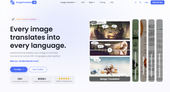
For anyone who has ever to localize a visual asset, the math has always been painfully simple: one new language equals one full redesign. Extract the text, send it to a translator, wait for the return, then painstakingly rebuild the layout in Photoshop or Figma—matching fonts, adjusting kerning, praying the new text fits the old button. It is a workflow that has not changed in decades. Then a new breed of AI tools started appearing, promising to automate the grunt work. Most of them failed at the one thing that actually matters: keeping the design intact. AI Image Translator takes a different approach. It does not treat translation and design as separate steps. It treats them as a single problem and solves them together.
The Real Cost of Visual Localization: Time, Talent, and Creative Energy
The hidden cost of translating images is not the translation itself. It is the design rework. A marketing team might spend weeks perfecting a product hero image—the typography, the spacing, the visual hierarchy. When it is time to launch in a new market, that work gets handed to a designer who has to reverse-engineer the entire layout. The result is never quite the same. Fonts get substituted, spacing drifts, and the visual identity that took months to build starts to fray across different language versions.
Why Traditional Workflows Break Down
The Font Matching Problem
Most localization workflows treat text as a separate layer that gets pasted back onto the image. But fonts do not scale uniformly across languages. A German translation of an English phrase is often 30% longer. A Japanese translation might be shorter but require different character spacing. Designers end up making compromises that weaken the original visual intent.
The Background Reconstruction Nightmare
Removing text from an image is not as simple as deleting a layer. The background behind the text needs to be reconstructed—matched in color, texture, and gradient. This is painstaking manual work that consumes hours for a single image. For batch localization, the cost multiplies across every asset and every language.
A Different Architecture: Translation and Design as One Process
The platform approaches the problem with a three-stage pipeline that prioritizes visual integrity at every step. The workflow is deceptively simple: upload an image, select a target language, download the result. But what happens in between is where the engineering shows.
Stage One: Intelligent Text Detection
Beyond Simple OCR
The system does not just recognize characters; it understands text as a design element. It identifies text boxes, speech bubbles, buttons, and labels as distinct visual components with their own spatial relationships. This contextual awareness is what enables the next two stages to work effectively.
Handling Complex Layouts
For images with overlapping text and graphics—such as magazine layouts or technical diagrams—the detection engine maps the entire visual hierarchy. It knows which text belongs to which element and how they relate to each other spatially.
Stage Two: Background Inpainting and Text Removal
Preserving What Lies Beneath
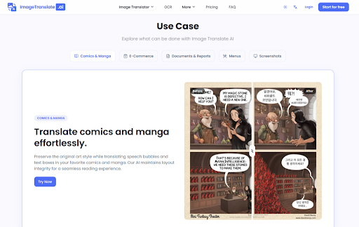
Once text is detected, the system removes it and reconstructs the background. This is where many translation tools fall short, leaving artifacts or smudged areas where text used to be. The platform uses inpainting techniques that analyze surrounding pixels to fill the gap seamlessly.
The Result: A Clean Canvas
After removal, what remains is a clean version of the original image—no text, no artifacts, just the visual foundation ready for new text to be placed.
Stage Three: Style-Matched Text Reinsertion
Matching Fonts, Colors, and Sizes
The final stage places translated text back into the image, matching the original font style, color, size, and position. The system does not have access to the original font files, so it approximates based on visual characteristics. For most use cases, the match is close enough that the untrained eye cannot tell the difference.
The Translation Editor for Pixel-Level Control
After the automatic process completes, users can open the translation editor to fine-tune the result. Fonts can be swapped, colors adjusted, sizes modified, and positions nudged. This is not an afterthought—it is a recognition that automatic systems are not perfect and that professional work requires human oversight.
Testing the Workflow: From Upload to Final Output
To understand how this plays out in practice, I ran a series of tests across different image types. Each test revealed something about where the tool excels and where it still requires human intervention.
Test One: A Product Hero Image with Layered Typography
The Setup
A skincare product image with a bold product name in a serif font, a smaller descriptive line in sans-serif, and a promotional badge in a corner. The background was a gradient with subtle texture.
The Execution
Upload took three seconds. Language selection was straightforward—auto-detect source, choose target. Processing completed in about four seconds. The downloaded image showed the product name translated and reinserted with the same bold weight and central positioning. The descriptive line was reflowed to fit the original text box, with font size adjusted automatically. The promotional badge retained its stylized appearance.
The Verdict
For e-commerce use, the result was production-ready. The only noticeable difference was the font—the system used a similar serif but not the exact typeface. For most storefronts, this is acceptable. For brand-identity-critical work, the translation editor allows manual font substitution.
Test Two: A Complex Magazine Spread
The Setup
A two-page magazine layout with pull quotes, captions, and body text in multiple columns. The design relied heavily on precise spacing and visual rhythm.
The Execution
The detection engine identified all text elements correctly, including the pull quote that spanned two columns. Background inpainting handled the text removal cleanly. The reinsertion stage placed translated text in the correct positions, with column widths adjusted to accommodate longer German phrases.
The Verdict
The result maintained the overall layout integrity, but the automatic spacing was not perfect. The pull quote required manual adjustment in the translation editor to match the original visual weight. For designers who value precision, the editor becomes an essential part of the workflow rather than an optional extra.
Test Three: A UI Screenshot with Dense Interface Elements
The Setup
A software interface screenshot with menu items, button labels, tooltips, and a sidebar with nested options. The text was small and densely packed.
The Execution
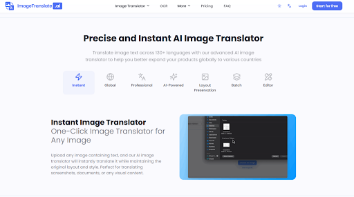
OCR accuracy on small UI text was impressive—every menu item was detected correctly. The translation preserved functional meaning, which is more important than literal accuracy for UI work. Button labels were translated with appropriate brevity to fit within the original button dimensions.
The Verdict
For software localization, the tool delivers significant time savings. The batch mode is particularly useful here—translating an entire UI screenshot set in one go eliminates the repetitive work of manual text replacement.
Where the Tool Fits in a Designer’s Workflow
The platform is not a replacement for professional design tools. It is a bridge between translation and design that eliminates the most tedious part of visual localization.
For Marketing Teams
Product images, social media graphics, and promotional materials can be localized without waiting for design resources. The batch mode supports up to 20 images processed simultaneously across up to 10 target languages. A marketing manager can upload a set of hero images and receive localized versions in multiple languages within minutes.
For E-commerce Operations
Product listings with text embedded in images—size charts, feature callouts, ingredient lists—can be translated without rebuilding the entire listing. The workflow is straightforward: take the existing image, drop it into the tool, choose the target language, and get a version ready for upload.
For Content Creators
Social media content, infographics, and visual stories can reach international audiences without additional design work. The translation editor provides enough control to polish the final output without requiring a full redesign.
The Limitations That Keep It Honest
The tool is powerful, but it is not magic. Understanding its boundaries is essential for using it effectively.
Font Matching Is Approximate
The system matches font style rather than exact typeface. For most commercial use, this is sufficient. For brand work where a specific font is non-negotiable, the translation editor allows manual font selection, but this adds time to the workflow.
Complex Backgrounds Can Challenge Inpainting
Images with text overlaid on complex patterns, detailed illustrations, or busy textures may show minor artifacts where text was removed. In testing, clean, high-contrast images performed flawlessly; busy backgrounds required editor corrections.
Translation Quality Varies by Language Pair
While the platform supports over 130 languages, translation quality is not uniform across all pairs. Common pairs like English-Spanish perform better than rare combinations where training data is thinner. This is a limitation of the underlying translation models, not the image processing layer.
Results May Require Multiple Attempts
Some images—particularly those with dense, overlapping text or unusual layouts—may need more than one translation pass. The automatic detection occasionally misreads text order in complex layouts. The editor fixes this, but it is not a one-click miracle for every image.
A Tool for Designers Who Value Their Time
The platform does not replace the designer. It replaces the hours of tedious text extraction, background reconstruction, and layout rebuilding that have always been part of visual localization. The translation editor ensures that designers still have final control over the output, but they start from a 90% complete result rather than a blank canvas.
For teams that localize visual content regularly, the time savings are substantial. For occasional users, the free tier offers enough capacity to test the workflow without commitment. The real value is in the reduction of friction—moving from “we need to translate this image” to “here is the translated image” in seconds rather than hours.
AI Image Translator represents a shift in how visual localization works. It does not eliminate the need for human judgment, but it eliminates the grunt work that has always made visual localization expensive and slow. For designers who have spent years rebuilding layouts for every new market, that is a meaningful change.